
The thumbnail is the new trailer
Last updated: June 4, 2026
If you’ve made something you’re proud of and it’s still landing with a thud, that stings. A lot. Sometimes it isn’t the story that’s failing, it’s the doorway. A thumbnail can’t promise a viral hit, but it can stop the quiet heartbreak of people scrolling straight past work that genuinely deserves a chance. This post gives you a simple thumbnail brief you can use today, plus a few traps to avoid so you don’t win clicks and lose trust.
It is written for one person. A filmmaker, producer, or creator who cares about craft, and who wants the right viewer to find the work without turning the work into bait. Over the years, I’ve watched videos with solid edits underperform. A little additional effort from those marketing teams would have likely helped with views.
A wider look at how platforms and spaces shape viewing choices is in how audiences choose what to watch.
The first image sets the contract
Most people talk about thumbnails like they are marketing. In practice, they behave more like a compressed trailer. A trailer asks for time. A thumbnail gets one glance. That glance sets expectation and mood before the viewer has even read the title properly.
People respond to thumbnails for simple human reasons. We scan quickly, and the brain tends to prioritise faces, emotion, and strong contrast because they are easier to decode at a glance. Research analysing thousands of YouTube thumbnails found that clearer emotional signals in the image are associated with higher view counts, which helps explain why one readable expression often beats a more detailed but ambiguous design when it is seen small. One example is this study on thumbnail sentiment and viewer attention.
Here is a quick reference box I use when teams argue about what the image is meant to do.
YouTube thumbnail
A public stop sign in an endless feedNetflix artwork tile
A personalised nudge inside a catalogueCinema key art
A tone statement that later has to survive phone size
Same job, different rooms.
A thumbnail is also a contract. It makes a promise. The opening minute either pays it off or it does not.
Because people decide quickly, so your promise needs to be obvious at tiny size.
Because a promise creates expectation, so the opening needs to confirm it fast.
Because trust accumulates, so honest packaging tends to help you over time.
At tiny size, clarity almost always beats cleverness.
If you want platform grounded guidance on what tends to work, YouTube summarises practical principles in thumbnail and title tips.
Three rooms that reward different choices
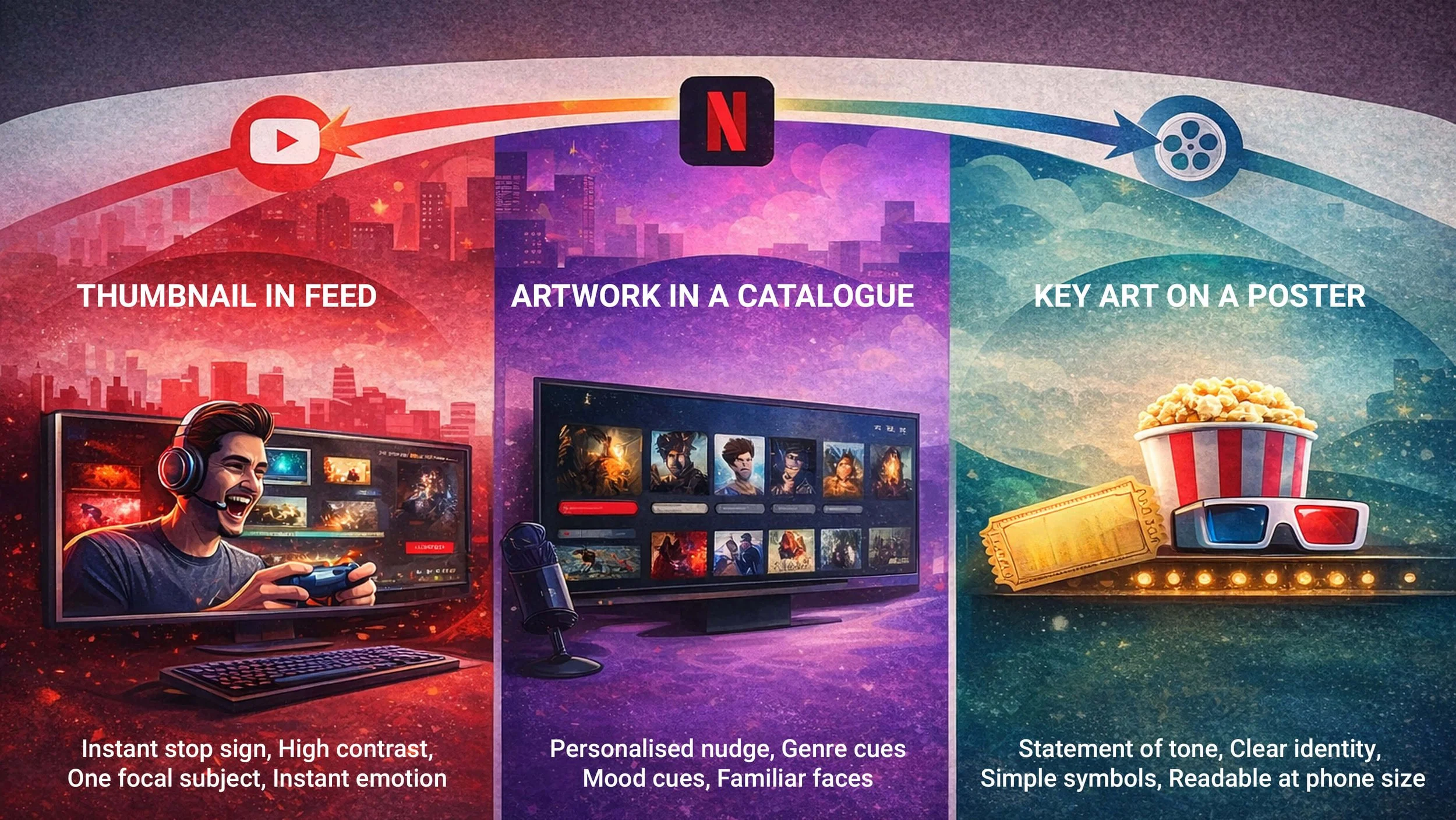
The same video image plays three different roles depending on context: stopping the scroll in feeds, signalling fit in catalogues, and building identity in posters.
The same job looks different depending on where the image lives. This is why advice can feel contradictory. One image can be a strong YouTube thumbnail and a weak Netflix tile, and both statements can be true. A useful way to frame it is the Three-Room Thumbnail Model.
YouTube feed
On YouTube the thumbnail competes in an open feed. It needs to read instantly, often on a phone, often with partial attention. That is why high contrast, one focal subject, and one readable emotion tend to show up again and again. Not because everyone is copying, but because the room punishes confusion.
A useful way to think about it is this. You are not asking someone to watch yet. You are asking them to stop.
Netflix catalogue
On Netflix the tile competes inside a catalogue. The viewer is not choosing between your video and everything on earth. They are choosing between the next few tiles on the same row. That shifts the job towards fit. Genre cues. Mood cues. Familiar faces.
It also explains why one person can see a different image from a friend. Netflix researchers have described artwork personalisation as selecting images per member and title to provide better visual evidence for why a title might appeal, such as highlighting an actor you recognise or a moment that signals the kind of experience it is. You can see the details in the Netflix artwork personalisation paper.
A simple way to say it is this. The platform is not changing the film. It is changing the argument the interface makes for why you should press play.
There is a trade off. Personalisation is helpful when it highlights a real facet of the story. It can backfire when it sells a version of the film that barely exists.
Cinema key art
Cinema key art has a different rhythm. It has time to build identity. It needs to hold up on a poster, then later survive being crushed into a small tile when the film lands on streaming. That pressure is why modern key art often goes simpler. One face. One symbol. One clear emotional read. It is not always creative decline. It is readability.
A quick way to keep the three rooms straight.
YouTube rewards instant legibility
Netflix rewards fit and evidence
Cinema rewards identity and tone that lasts
What breaks thumbnails in real life
Most thumbnail failures are not mysterious. They usually happen because the maker is thinking like a viewer with time, not a viewer with a thumb.
Use a quick because so check.
Because the image is seen small, so fine detail and cleverness often vanish.
Because the image sets expectation, so a misleading promise can raise clicks and lower satisfaction.
Because platforms learn from behaviour, so a mismatch can hurt future reach even if the video is good.
Here is a table you can reuse as a diagnostic.
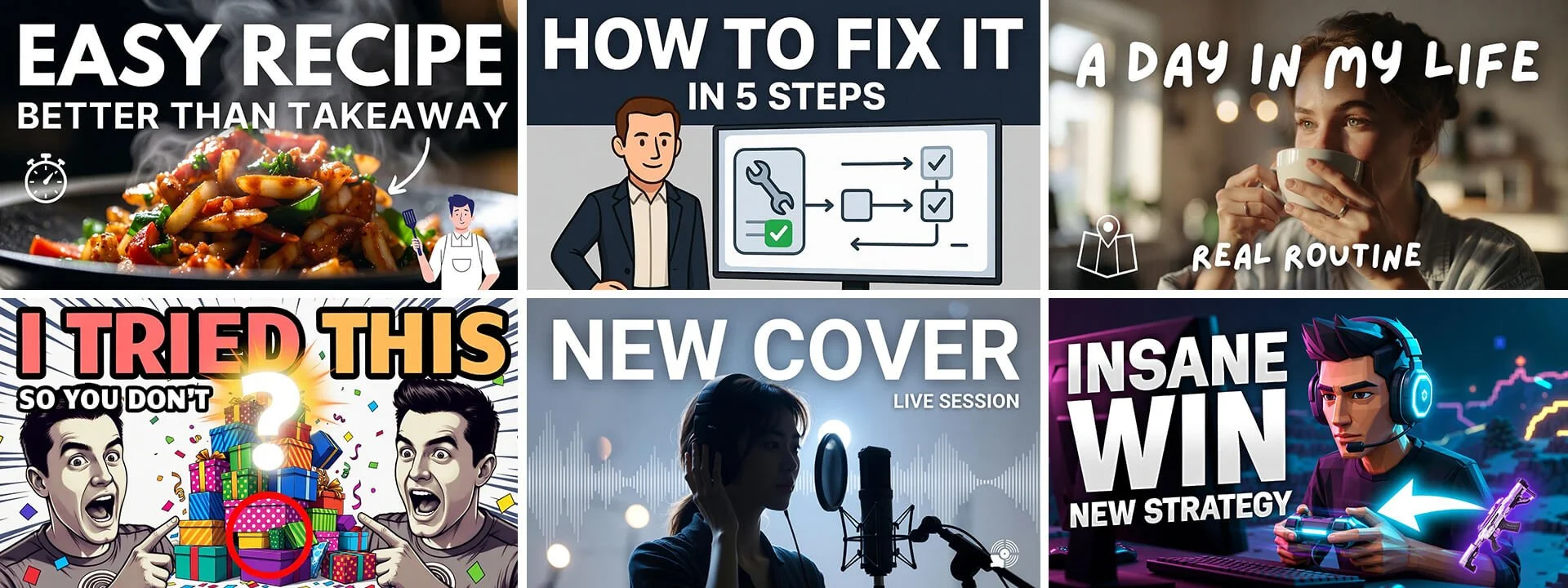
| Thumbnail move | What it does well | Why it gets overused | What to do instead |
|---|---|---|---|
| Collage of many elements | Shows variety and production value | No focal point, so the message disappears | Pick one subject and one proof detail, then simplify everything else |
| Forced shock expression | Reads emotion fast in a feed | Signals clickbait and attracts the wrong viewer | Use a real emotion that matches the opening minute, even if it is quieter |
| One thumbnail for every platform | Saves time and keeps branding consistent | The room changes the job, so one size fits poorly | Keep the promise consistent but adjust framing and proof detail for feed, catalogue, and poster scale |
| Over polished AI faces and stock imagery | Generates fast variations at low cost | Feels generic and viewers often swipe past | Use AI for rough options, then ground the final image in real frames or your own photography |
| Promising a moment that is not in the video | Can spike clicks briefly | Breaks trust and can breach platform rules | Show a proof detail that appears in the first minute so the promise is paid quickly |
| Too much text | Adds context when the title is vague | Becomes unreadable on mobile and clutters the promise | Use one short phrase or none, and let the image carry the idea |
| Vague cinematic mood shot | Looks premium and filmic | Does not explain what the video is about | Add one clear subject plus one outcome or genre cue that makes it legible |
One last warning here. Clickbait often fails in a predictable way. It pulls in the wrong viewer. Because the promise is distorted, so the opening feels like a let down. People leave early. The platform learns that the video attracted interest but did not satisfy it.
YouTube also treats misleading thumbnails and metadata as a policy issue when the image leads viewers to expect something that is not actually in the video, which is set out in the misleading thumbnail rules.
A thumbnail brief you can use today
Here is a brief that works across YouTube, Netflix style tiles, and cinema key art. Copy it, fill it, test it.
One sentence promise
Write it in plain language. If you cannot write it, the thumbnail will struggle.One dominant emotion
If the emotion is unclear, the image often feels like wallpaper.One focal subject
A face often works. An object can work. A collage rarely does.One proof detail
Something real that appears early in the video.One mobile crop rule
Keep the key elements in the safe centre so they survive different layouts.
Now test without drifting into bait.
A common YouTube practice is to make two versions that keep the same promise, then change one thing only. Swap the expression. Change the proof detail. Tighten the crop. Let it run long enough to be fair, then judge by click through rate and average view duration together. If click rises but watch time drops, the thumbnail is usually attracting the wrong viewer.
If you have access, YouTube Studio explains how eligible creators can test options in A B test titles and thumbnails.
Quick guide checklist
Does the image honestly represent the first minute?
Is the key element readable on a phone at tiny size?
Is there one focal subject?
Is the emotion clear without context?
Is there one proof detail that appears early?
Would you click if the title was hidden?
Have you tested two versions, changing one thing only?
Key takeaways and one small experiment
A thumbnail acts like a compressed trailer
The room changes the job, feed, catalogue, poster scale
Netflix has described selecting artwork per member to give better evidence for why a title might appeal
Clickbait can attract the wrong viewer, and misleading thumbnails can breach platform rules
A simple brief plus a small test beats guessing
Pick one video that deserves more views. Make two thumbnails with the same promise and change one thing only. Let them run long enough to be fair. If click rises but watch time drops, the doorway is pulling in the wrong crowd. If both rise, you have probably found a promise that fits your audience and the room it lives in.
One question to sit with.
Are you making the promise your work actually keeps?