
Captions That Work: How Subtitles Quietly Lift Watch Time Across Platforms
Last updated: April 23, 2026
A lot of brand videos lose viewers for a boring reason. People cannot follow the point fast enough with sound muted, so they scroll past before the message lands. Captions help when they are treated as part of the hook, not a finishing task added at the end.
Captions are on screen text designed for access, including key sound cues, subtitles translate or clarify spoken words, and on screen text is a creative layer that is not a reliable substitute for either. In practice, brand work often uses all three, but only captions and subtitles should be trusted to carry meaning when sound is off.
Subtitles for social video are not just about accessibility. They are a performance layer that reduces effort for the viewer and protects meaning when attention is split across rooms, devices, and feeds. When they are done well, people stay long enough to understand the point, even if they never turn audio on.
When viewing happens across inconsistent environments, videos need to survive modern viewing habits. That shift is why caption decisions now sit closer to strategy than post production.
Quick navigation
If time is tight, jump straight to the section you need. These cover the essentials for captions that hold attention, stay accurate, and work across platforms.
Why captions change performance, not just polish
Captions help because they remove friction. A viewer should not have to work to understand what is happening, who is speaking, or what the offer is. If meaning takes effort, the scroll wins.
The biggest lift usually comes from the first seconds. If the first caption line explains what the video is and why it matters, more people stay long enough to get the rest. This is where caption passes fall short, because they start transcribing before they have clarified the premise.
A good caption pass also reduces revision loops. When stakeholders can follow the message without replaying, feedback shifts from confusion to craft. That usually means fewer late changes and a cleaner route to approval.
What the evidence can safely say
It is tempting to claim huge percentage lifts, but the safer approach is to treat published findings as a signal, then test on your own videos. Results vary by edit, audience, and category, so it is better to promise a method than a number. If a stat is used at all, it should lead to a simple test you can run, not a guarantee you repeat.
Meta has shared results from internal tests where captioned video ads increased view time on average. That is a useful signal that captions can change behaviour, even if it does not guarantee the same result for every brand video. Meta’s own wording is in their update on captioned video ads and view time.
The practical takeaway is simple. Captions will not fix a weak idea, but they will stop avoidable confusion from becoming drop off. If you want to prove it internally, publish two versions of the same cut and only change the captions, then compare early drop off and average view duration.
The CAPTION PROOF framework
Most caption advice online is a list of tips, which is fine until someone needs to sign off quickly. This is a review tool that turns taste into checks a team can agree on. It is built for brand teams who want consistent output without turning everyone into caption specialists.
Use it in this order. Clarity and accuracy protect meaning first, because the viewer needs to understand the point. Placement and style protect readability after, because the viewer needs to keep reading comfortably.
| CAPTION PROOF step | What to check | Pass looks like | Fail looks like |
|---|---|---|---|
| C for Clarity | First on screen line explains what this is | Plain language meaning line in the opening seconds | A tease, a slogan, or no premise |
| A for Accuracy | Names, numbers, product terms, places | Terminology is correct and consistent | Auto errors on key terms |
| P for Pace | Line length and reading effort | Short lines you can read on a phone without pausing | Walls of text or rapid fire captions |
| T for Timing | Captions arrive before the viewer needs them | Captions lead the thought and clear cleanly | Captions lag, overlap, or stick around too long |
| I for Invisible placement | Avoid UI, faces, products, legal text | Readable and unobstructed on a real phone | Captions cover key visuals or buttons |
| O for On brand restraint | Style supports meaning first | Clean style that matches tone and stays readable | Kinetic overload and constant emphasis |
| N for Noise control | Only include sound cues that matter | Short cues only when meaning changes | Lots of cues that distract |
| PROOF on device | Test with sound off on a phone | The video still makes sense when muted | Meaning depends on audio to land |
Captions do not have to be word perfect to be accurate. Most viewers read slower than people speak, so a literal transcript often becomes a wall of text that loses attention. A better default for brand work is meaning accurate captions, where names, numbers, and key claims stay exact, but filler words and messy spoken phrasing are tightened so the point reads cleanly.
There are a few times you should stay word perfect. If the line is a legal claim, a regulated statement, or a quote that must be precise, keep the wording as spoken and slow the captions down with clean breaks. If the line is casual speech, shorten it without changing meaning, and use the extra space to improve timing and readability.
Here is a quick worked example that shows the difference without changing meaning.
1. Spoken line: “So what we’re going to do today is basically walk through the three steps you need, and then we’ll show you the mistake most people make.”
2. Word perfect caption: “So what we’re going to do today is basically walk through the three steps you need and then we’ll show you the mistake most people make.”
3. Meaning accurate caption: “Today you’ll get three steps to follow. Then we’ll show the mistake most people make.”
Burn in or upload a caption file, and when to do both
This is the decision most teams do not make early enough. It affects performance because it affects who actually sees the text, not who could see it in theory. It also affects accuracy, because some workflows make editing easier than others.
Use this table as a briefing tool. Pick one approach per platform based on how people watch and how precise your language needs to be.
| Platform and use case | Burn in captions | Upload caption file | Do both |
|---|---|---|---|
| TikTok and Reels short form | Best default when you need captions always visible | Less common in fast publishing workflows | Only if you need a styled version plus an accessible track elsewhere |
| YouTube long form and evergreen | Use when styling is part of the creative | Best default for accuracy, accessibility, and reuse | Use if you want styled on screen text plus proper captions |
| Paid social with regulated or compliance language | Good for guaranteed visibility, but placement must be checked | Good when terms must be exact and traceable | Strong choice when you need visibility and an audit friendly text track |
| Events, brand films, and mixed playback | Often the most reliable for unpredictable environments | Only if playback definitely supports it | Rare, but useful when the same film lives in many places |
A simple rule usually holds up. Burn in for short form feeds where people rarely toggle settings, and upload a file for YouTube and evergreen content where accuracy and reuse matter. Using both is worth it when you need styled text and a proper caption track for accessibility. One extra advantage of an uploaded caption file is that it stays editable after publishing, so you can fix spelling, names, and timing without re-exporting the video. Burned in captions lock mistakes into the picture, which means even small corrections can turn into a full reversion and re-upload.
Platform checks that prevent the common failures
Platforms differ, but the checks stay consistent. You are trying to avoid collisions, avoid errors, and avoid relying on viewers to switch something on. Most caption mistakes are not technical, they are practical.
On YouTube, uploading a caption file is often the cleanest route when language precision matters. YouTube’s guide to caption file formats and uploads confirms it supports standard caption file formats like SRT, and an SRT file is a simple timed text file that tells the platform what words to show and when.
Auto captions are fine as a starting point, but treat them like a rough cut rather than a finished deliverable. Always check names, numbers, and product terms, because that is where mistakes tend to slip through and they are the ones viewers notice.
On short form platforms, the most common failure is placement. Captions that sit too low collide with interface elements, faces, hands, and product shots, so you need a quick phone check with the interface visible. Leave room for platform UI and any lower third graphics, because what looks fine in an edit window often breaks once buttons and overlays appear. If you never do that check, you are guessing.
On longer videos, the most common failure is accuracy. Auto captions are usually fine until they meet names, jargon, or brand terms, and that is where a quick edit pass pays for itself. It also stops the kind of small errors that make a brand look careless.
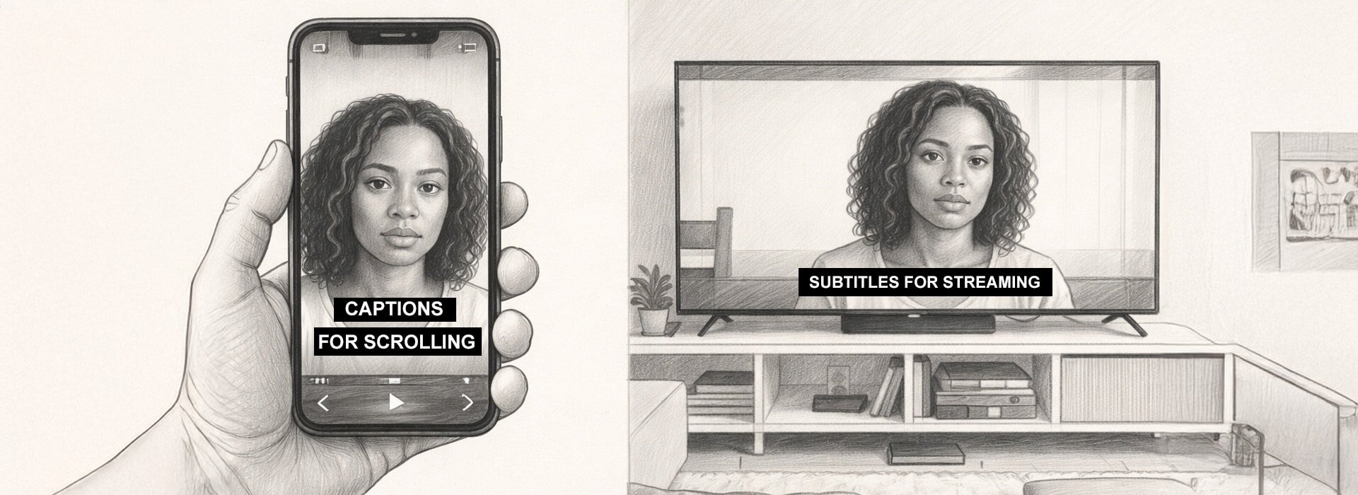
Feed captions are not streaming captions
If you are used to TikTok and Reels, it is easy to carry that styling into everything. It does not translate well to living room viewing, where comfort matters more than punch. The goal shifts from grabbing attention to keeping reading effortless.
Feed captions are designed for speed, silent viewing, and small screens. Streaming captions are designed for consistency, longer sessions, and reading at distance. If you use the same style everywhere, it usually fails in one place.
| Where the video lives | Viewer reality | Caption style that works | Common mistake | What to do instead |
|---|---|---|---|---|
| TikTok and Reels feeds | Fast scroll, sound often off, phone size | Short lines, selective emphasis, high contrast, safe placement | Highlighting every word and constant motion | One key line at a time, highlight one key word, clear quickly |
| Stories and vertical ads | UI overlays, quick exits, thumb holds | Two lines max, higher placement, clean breaks | Captions collide with buttons, faces, or products | Keep captions above the UI zone and test with interface visible |
| YouTube long form | Mixed devices, search driven entry, longer attention | Edited caption file, accurate terminology, steady pacing | Leaving auto captions unedited on key terms | Upload an edited file for anything evergreen or technical |
| Streaming services like Netflix | Living room distance, long sessions, comfort reading | Consistent formatting, comfortable pacing, minimal styling | Bringing social styling into long form | Prioritise comfort and consistency over attention grabbing effects |
CAPTION PROOF still applies, but the emphasis shifts. In feeds, placement and pace protect attention, because the viewer is deciding fast. In streaming, pace and consistency protect comfort, because the viewer is settling in.
Caption brief template you can copy and paste
Most caption problems are not caption problems. They are briefing problems that show up at the last minute as captions feel off or can we make them clearer, which then turns into rushed tweaks and inconsistent choices. A short brief prevents that by locking the three things captions depend on, meaning, terminology, and placement, before anyone starts styling or timing.
It also stops a common workflow trap. Captions often get added after the edit is signed off, so the captioner is forced to chase pacing that was never designed for reading. When the brief is clear up front, captions can be planned as part of the hook and the rhythm, which is usually where the watch time benefit comes from.
This table shows what each line in the brief protects against. It is useful when someone asks why the brief exists, or when a team is tempted to skip it to save time.
| Brief line | Prevents | Why it matters |
|---|---|---|
| Video goal in one sentence | Captions drifting into generic filler | Keeps the words aligned to the point and the call to action |
| Opening caption line for sound off | A dead opening that loses muted viewers | Protects the first seconds, which is where retention is won or lost |
| Must spell correctly list | Wrong names, prices, product terms | Avoids brand risk and stops time wasting corrections after publish |
| Tone notes | Captions that feel off brand | Keeps voice consistent across captions, graphics, and spoken script |
| Accessibility needs | Over captioning or missing meaning changing cues | Balances readability with genuine access needs |
| Placement rules | UI collisions and covered faces or products | Unreadable captions quietly kill watch time even when the edit is strong |
| Languages and sign off | Translation chaos and last minute approval scrambles | Keeps multilingual versions accurate and on brand |
| Deliverables needed | Wrong format delivered for the platform | Avoids rework and helps you keep captions editable when needed |
| Pre publish proof on a phone | Desktop safe captions failing in the feed | Catches placement and pace issues before they cost you reach |
Copy and paste caption brief
What’s this video trying to do, one sentence
What should the first line of captions say when sound is off
What words must be right, names, product terms, places, prices
What should it feel like, calm, playful, straightforward, premium, say it plainly
Anything for accessibility, only add sound cues when they change meaning
Where can captions sit, keep them off faces, off products, and away from the bottom UI area
Do we need other languages, which ones, and who signs them off
What do you actually need delivered, burned in captions, a caption file, or both
Final check before publishing, test on a phone with sound off and average brightness, then fix what breaks
Here is the quickest real world check. If a stakeholder asks for captions to be punchier, ask what they mean and put it into the brief as a tone note and a pace note, then the captioner can act on it. If you skip that step, you usually get random styling rather than clearer meaning.
QA scorecard for sign off
Use this as pass fail. It is designed for brand review, not specialist caption review, so it keeps the conversation simple. If something fails, you fix it before publishing rather than hoping it will be fine.
Caption QA scorecard
Clarity, does the first caption line explain what this is in the opening seconds
Accuracy, are names, numbers, and brand terms correct
Pace, can it be read on a typical phone without pausing
Timing, do captions arrive before the viewer needs them
Placement, do captions avoid UI and key visuals
Restraint, does styling support meaning rather than compete with it
Noise control, are sound cues used only when they change understanding
Proof, does the video still make sense with sound off on a real phone
If any item fails, fix it before publishing. Captions are cheap to change compared to distributing a video that loses meaning in silence. A single wrong number or name can also create unnecessary brand risk, which is avoidable with a short accuracy check.
SEO and multilingual benefits without overpromising
Captions can support discovery because they turn speech into text that platforms and search systems can understand. That can create more ways for a video to match queries without changing the edit, and it gives you a clean transcript you can reuse across descriptions and supporting pages. For a clear overview of how this works, see how captions and transcripts can support SEO.
Captions also help you scale languages without dubbing. Start with a clean transcript, translate from that transcript rather than from auto captions, and lock brand terms in a short glossary. Add subtitles as additional language tracks where the platform supports it, or burn in language versions for short form republishing when you need guaranteed visibility.
Key takeaways
Captions that lift watch time are not about more text. They are about less effort, fewer misunderstandings, and faster comprehension in the first seconds. That is why a basic caption pass can outperform a fancy styling pass that forgets readability.
Use CAPTION PROOF to keep captions clear, accurate, readable, and safe on every platform. Use the burn in versus upload decision table to choose the right delivery, and use the brief and QA scorecard to make captions repeatable across projects. If you do one thing this week, rewrite the opening caption line so it explains what this is and why it matters, then test the video on a phone with sound off before it goes out.
Further reading and subtitle standards
If you want to go deeper, these resources are worth bookmarking. They are practical, widely used, and helpful when you need proper subtitle standards rather than guesswork.
| Resource | Best for | Who it suits |
|---|---|---|
|
|
Understanding subtitle basics like line handling, reading comfort, and avoiding picture clashes | Producers, editors, captioners, and anyone who wants a solid baseline for readable subtitles |
| Professional streaming expectations, consistency rules, and what good looks like at scale | Teams delivering long form, series, docs, or anything that needs consistent timed text standards | |
| Knowing the web standard behind VTT caption files and how timed text works in browsers | Web teams, developers, and producers shipping captions on sites, players, and LMS platforms |